August 21, 2014,
A while back I was in Belgium to speak at a transportation conference. It was a fast week with
three days swallowed up by the conference, two by travel, and one free day.
The conference in Brussels offered me an intense exposé for experiencing living history again. A colleague had passionately advised me not to miss Bruges at all cost. On my agenda was to see and experience the new train station at Liege by Santiago Calatrava. So with my one free day I bought two train tickets, each in opposite directions; first I went south east of Brussels to Liege, and finished the day north west of Brussels in Bruges. In between conference functions I had enough time to also see some of Brussels. All three places were stunning in their own right.
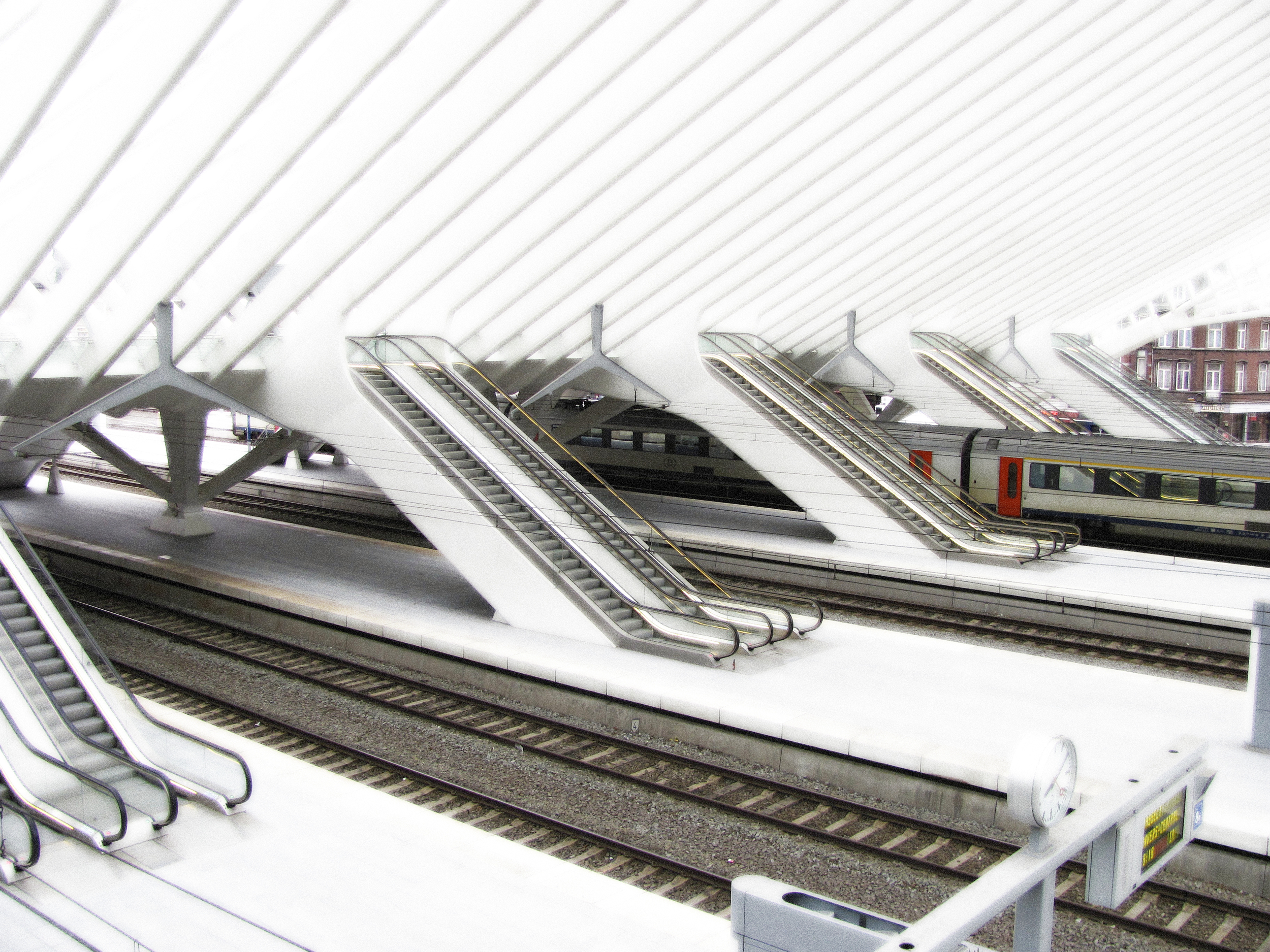
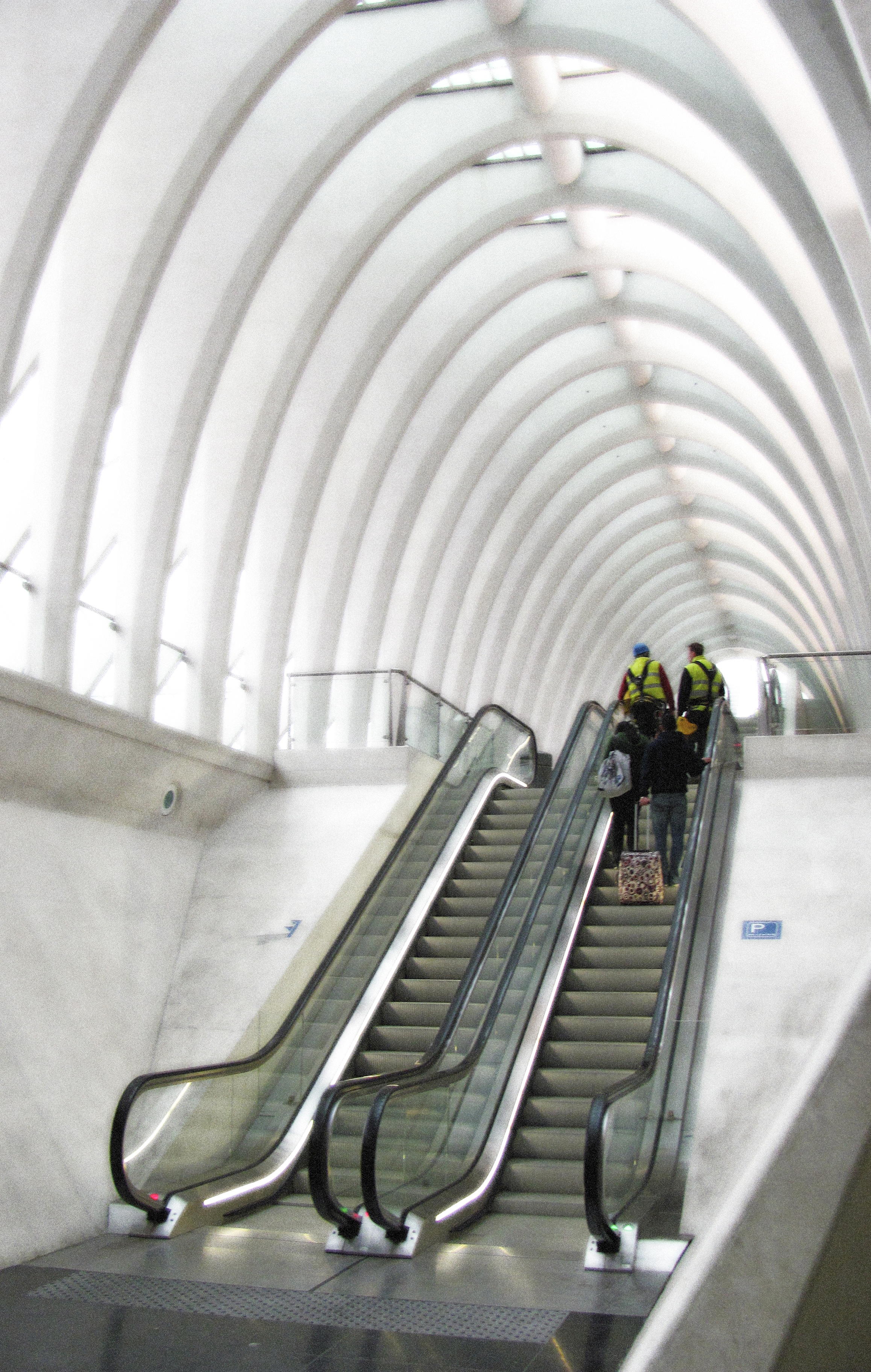
Liege is about a 45 minute train ride from Brussels. My train stopped at one of the outbound platforms which are not within the main terminal but covered by long tapering steel and glass canopies, so my 'awe' response was held until I walked back into the main rail concourse. Even after looking at successive publications on new work over the years by this design firm it was a completely 'otherly' experience walking into this building. Construction was just finishing. There were a couple of glaziers at the top of the main hall roof finishing fitting glass, and a set of stairs with granite treads being completed.
With a magnificent space, soaring volumes, and mind boggling flying cantilevers, what struck me was how much this train station is viscerally within the tradition of the grand European train stations of the early and late 19th century. And as I looked more closely you could both see and feel how station industrial design elements like clock and light standards, and signage and wayfinding have evolved through traditional design history to contemporary tectonics and aesthetic. And the placement of elements is........where you expect it to be......in a traditional sense.
I spent half the day walking through and around the building, sat for a long time on the concourse grand stair that led down to an urban plaza and green space and watched people coming and going. I found that this public space is also quiet classically a very active public forum. Different from many train arrival experiences which are typically on the back side of town in industrial areas, this building is truly a civic event. I was reminded of the great rail station in Perth, Western Australia, which occupies the centre of the civic core and ties both halves of the city's core together.....linking commercial and civic districts together....a remarkable feat when successful.
The Liege train station is by far some of the most impressive craftsmanship in steel and concrete on epic proportions that I have seen (along with the Reichstag in Berlin and the British Museum), similarly so is the engineering. The public concourses at grade but below the train platforms are given equal attention as the grand hall, and although detail is only really present in smaller elements such as transportation fixtures, wayfinding and built in furniture, the structural architecture, finishing and integration of material palette is superb. Calatrava's consistent palette of materials and white architecture gives no less a sense other than profound refinement and delicateness even given enormous structural proportions. I had a profound sense that you were somewhere special that ironically had the quality, effervescent light and spirituality of an old world cathedral. Unlike many buildings of this functional typology, this building could easily be transformed into a religious space or a sports arena.
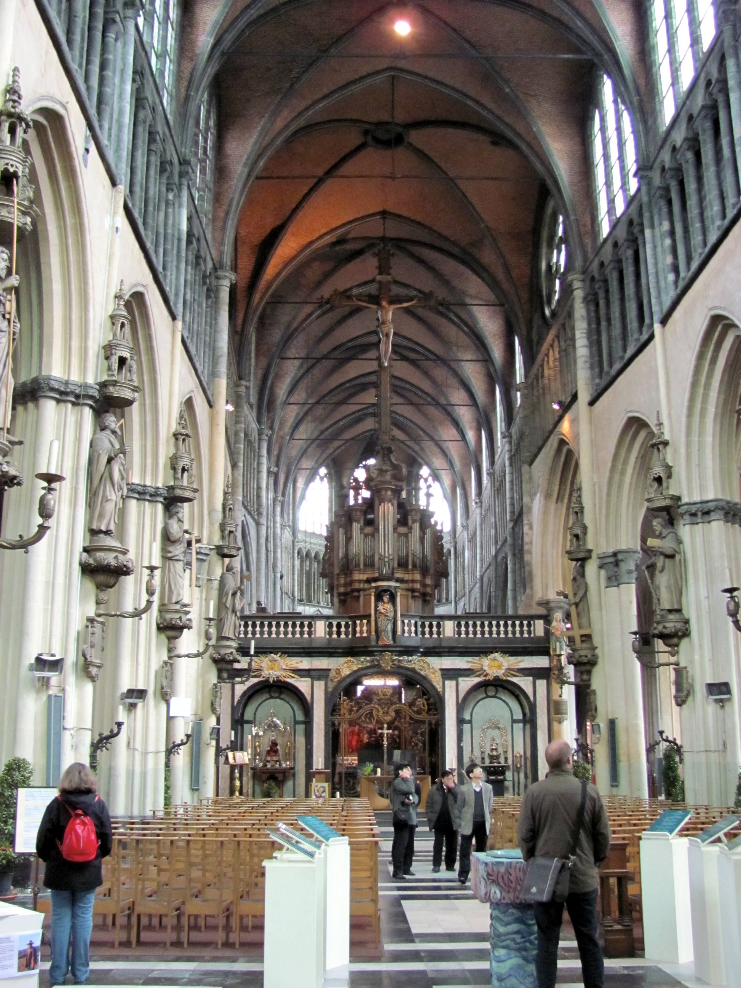
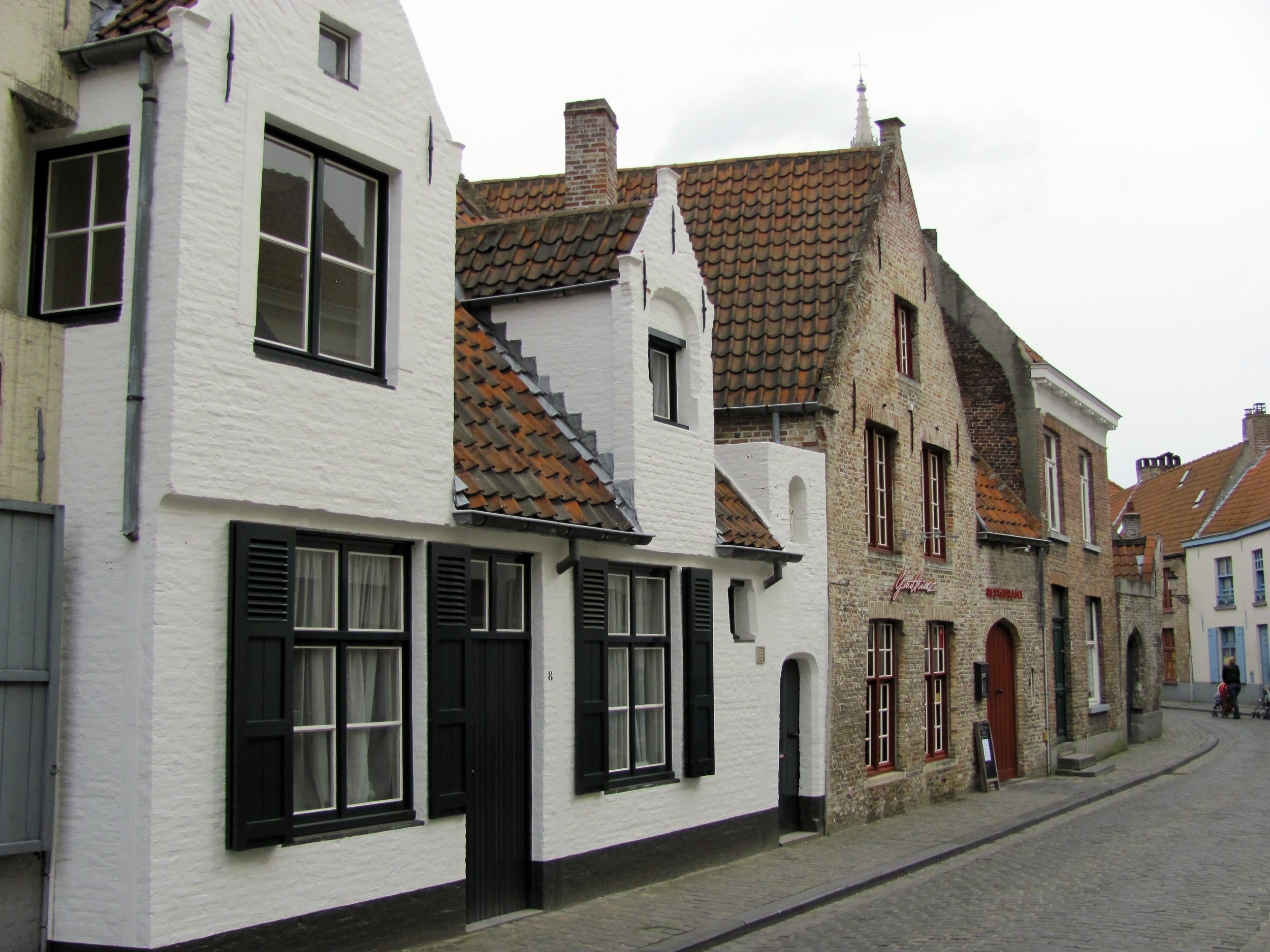
After feeling quiet completely full I boarded the train back to Brussels which flew through the city to Bruges. This Unesco World Heritage city was about a twenty minute walk from the station, which is a more typical arrival experience. You know you have arrived at the old city because you cross over the canal that draws a ring around it. Bruges apparently is one of the extremely few cities that was untouched during the Second World War (even though it was used as a U Boat submarine base) and therefore uniquely and remarkably intact. The range of public spaces is an experience in diversity, but unanticipated is the scale of buildings and streets........I thought I was in one of Pieter Bruegels paintings full of little people.
I found the difference in the morphology of this old world city intriguing. Bruges made me think of Venice, a dense canal city. The differences and singular uniqueness' make a notable study. It was evident that there were very different cultural influences shaping the character of places (a given), streets, canals, and variety of sizes of squares in Bruges quiet differently from the similar compactness of Venice. Significantly, being a canal city along a river as opposed to in an ocean lagoon affected by tides and such, as well as the differences in the predominant form and pattern of mercantile activity through canals versus canals and streets had differing physical outcomes.
Bruges old city however did remind me of Venice, but unlike it, the horse drawn cart, and alas today the automobile, had a place in the life of the inner city.......a fundamental structural and form giving difference from Venice. Bruges is rich in every way, from a historical city continuing to house contemporary life to it's amazing vernacular architecture and architecture of high culture, art and craftsmanship, preserved urban form and civility. It is a city not to be missed for it offers much study for every interest.
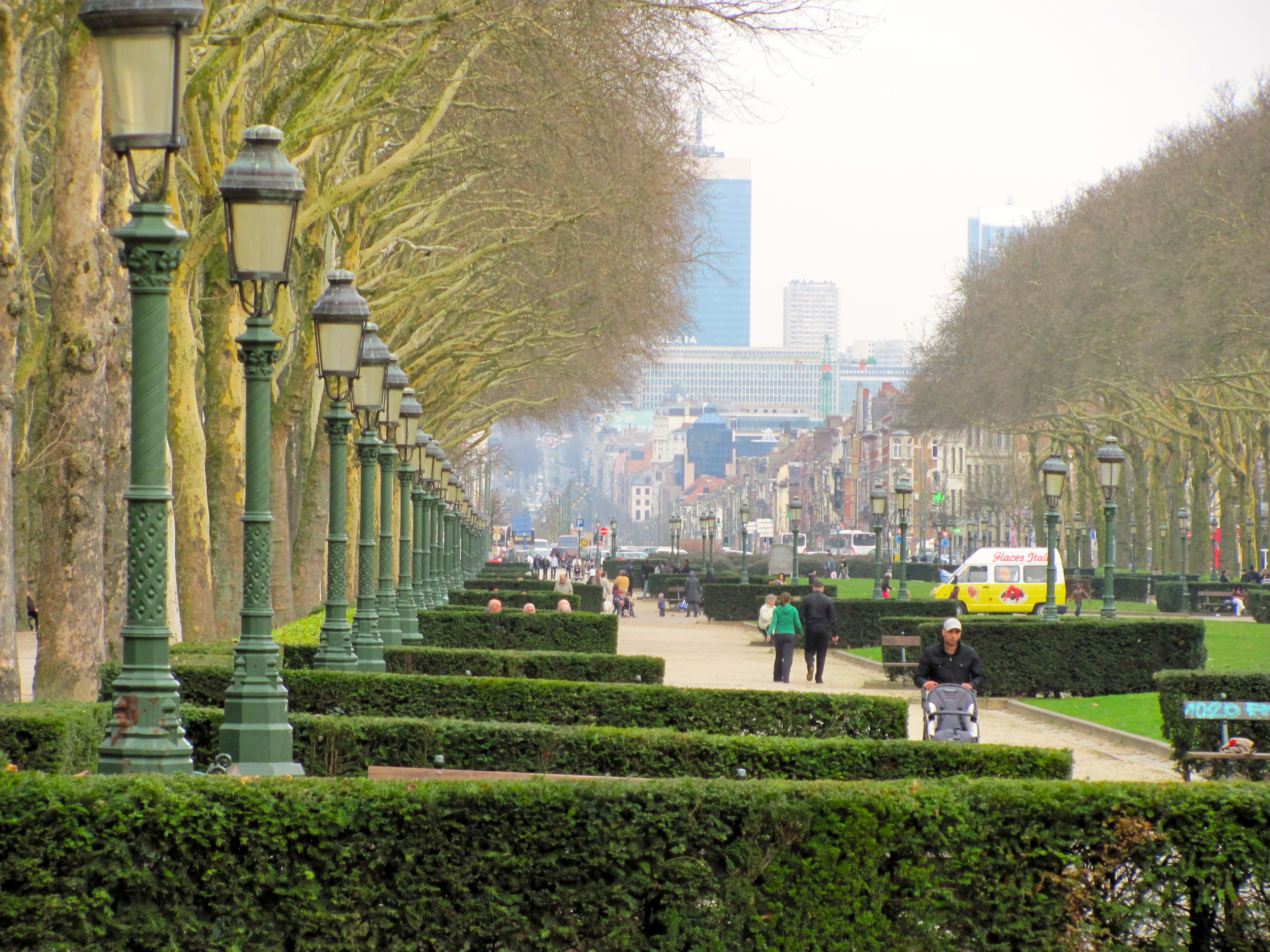
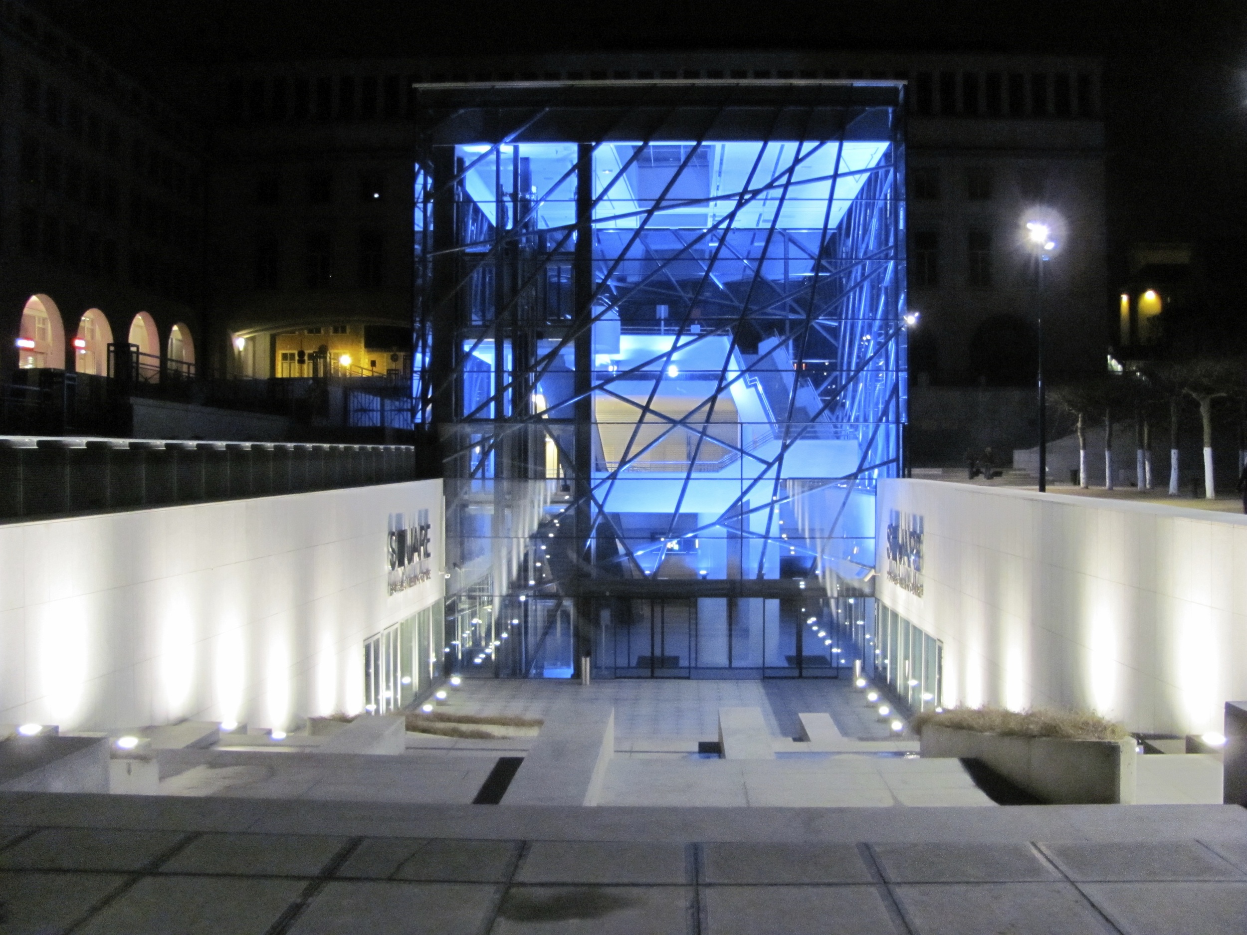
Although my time in Brussels was conference busy during the day, I did have time to see a fare area of the urban core and old city. One of my prior interests was to see the new Brussels Meeting Centre by A2RC Architects which was built in 2009 after a successful competition win in 2000 by this firm. This project bings a contemporary focus to the Palais des Cogress and the Quartier des Arts. It's central focus is a ceremonial stair into a glass cube containing circulation from upper plaza to new meeting halls below. It is an extraordinary pavilion and facility, minimal and abstract as well as classically formal.
The Centres placement and fit into it's context and landscape is beautiful. The context sits within an urban slope with stunning visual connections looking out at the entire site and old city below. Both the pavilion and some above grade meeting rooms have stunning vistas to the city. And like Liege Train Station the European craftsmanship and quality of civitas is notable. The complex is compact and although minimally contemporary fits harmoniously with the impressive plethora of historical architecture surrounding it.
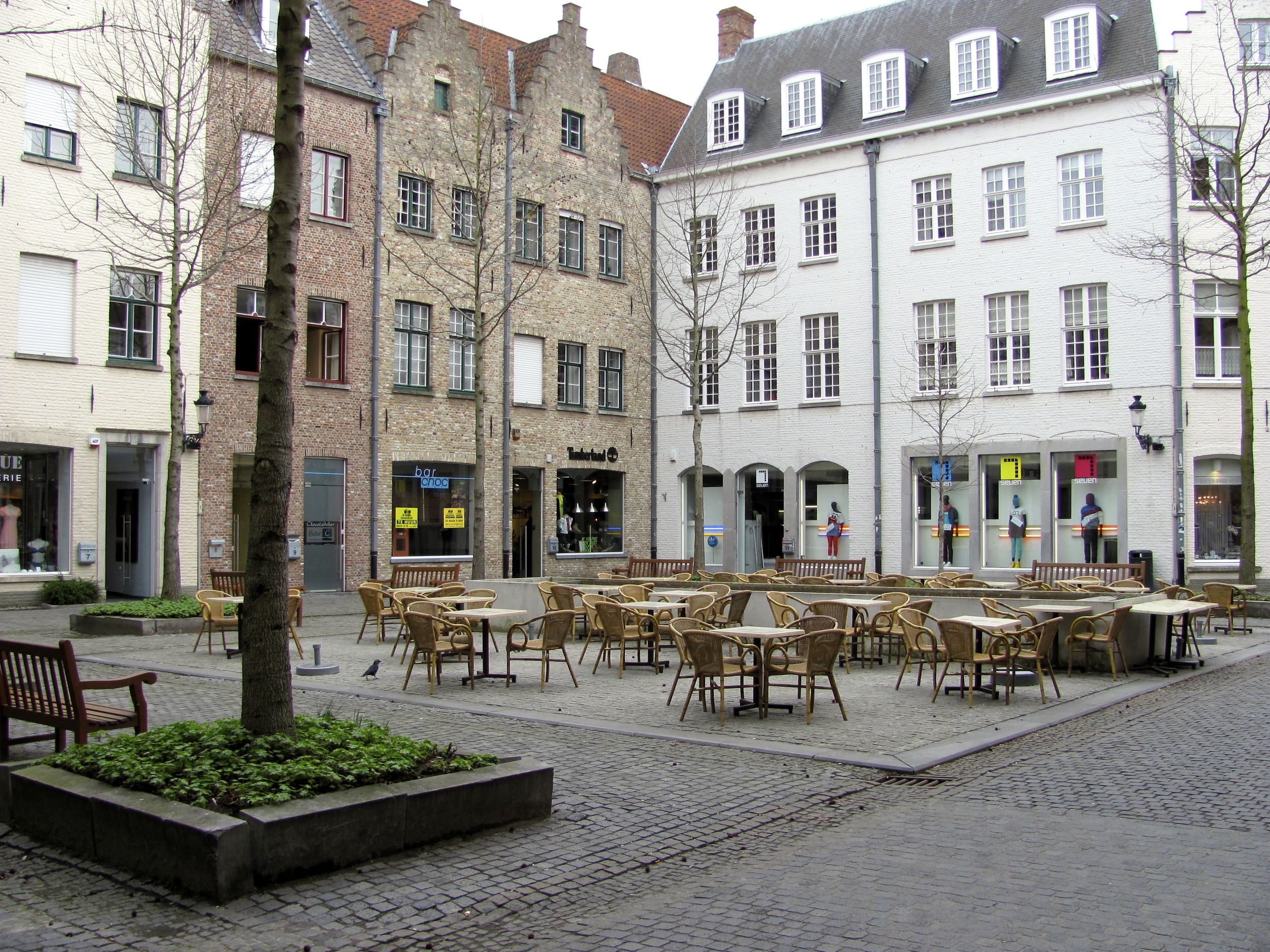
There were many night walks through Brussels old city..........a feeling as though you were walking through great novels, and daytime trips back to the hotel through different routes. Like so many cities throughout Europe and the Mediterranean, the variety of public spaces was a living exhibition of diversity and range of scale, spatial texture and in many cases landscape. What I did fall in love with again was that unlike many small and large North American cities, there is life after dark in many of these public spaces. And I mean that in terms of neighbourhoods not just the gentrified urban spots for tourist consumption or grand public squares. This aspect is not the same in North America where many parts of urban centers are deserts at the end of the business day.
In urbanity, morphology in my mind is everything, it is a vessel that makes or breaks urban experience, habitability and energized life. Time, and aggregated change over time are certainly part of the equation, but equally distinctive is the mix of living, working, amenity..........ritual, and spectacle, the basics that breath life into the idea of neighbourhood and create a sense of profoundness of place.


